Lightsaber Escape: An Experience Built for Chrome
“The 3D graphics were built with WebGL. There’s no lag or latency that I could notice. No plug-ins needed. Yes, Google is showing off its web chops with this experience.”
Lightsaber Escape is a second screen Chrome Experiment created in partnership with Disney, Lucasfilm and Industrial Light & Magic for Star Wars: The Force Awakens.
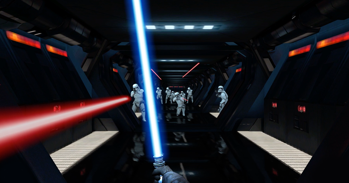
We pushed the boundaries of what’s possible on the web by turning your phone into a lightsaber in a battle against stormtroopers on a second screen for the full on geek-out you have long been waiting for.
Synch 'em up
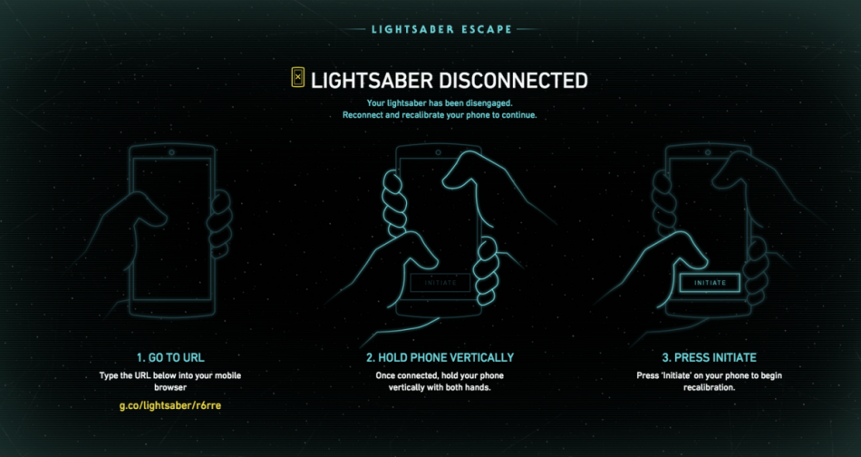
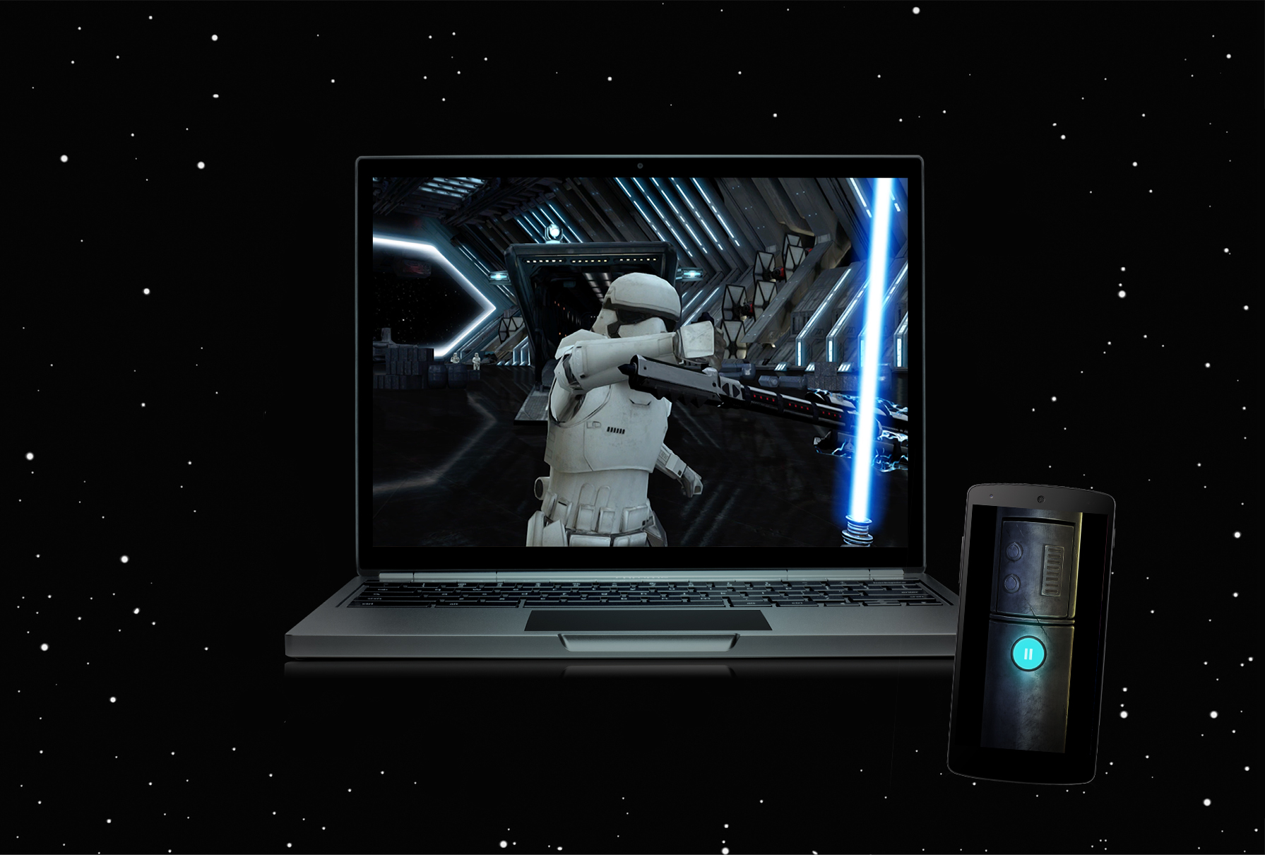
Follow the on-screen instructions. You’ll need to go to the corresponding URL on your mobile browser and calibrate your smartphone by holding it up to the screen. Once calibrated, you can start a tutorial where you learn to battle a single stormtrooper, before moving on to a whole army of them.
The Experience
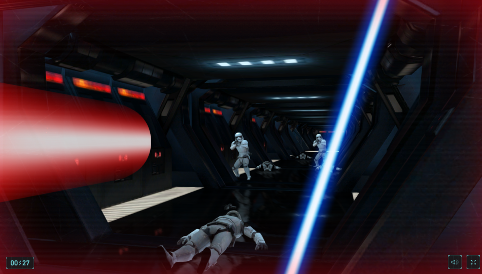
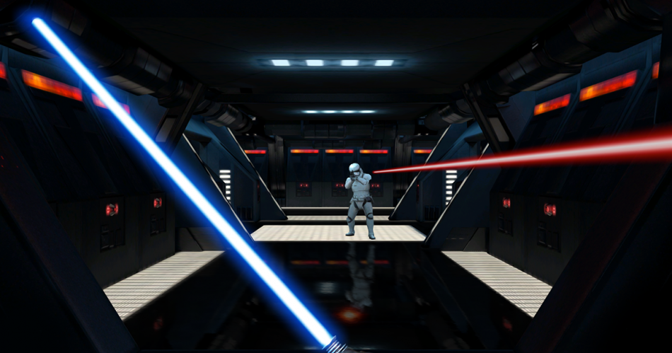
The experience starts inside the corridors of a star destroyer. Users slide through a ventilation shaft only to be met by a stormtrooper.
“The first time I activated the lightsaber on my phone and heard the appropriate sound effects as I waved it around, I’ll admit, I had a big, goofy grin on my face.”
The game eventually comes to a final scene, facing a classic duel with a boss stormtrooper. If your lightsaber skills are up for it, the opponent falls to the ground, defeated. When an escape is finally in sight, users run toward the transport shuttle and take off to safety.


“Google just unleashed its coolest Star Wars-themed project yet.”
Social Integration
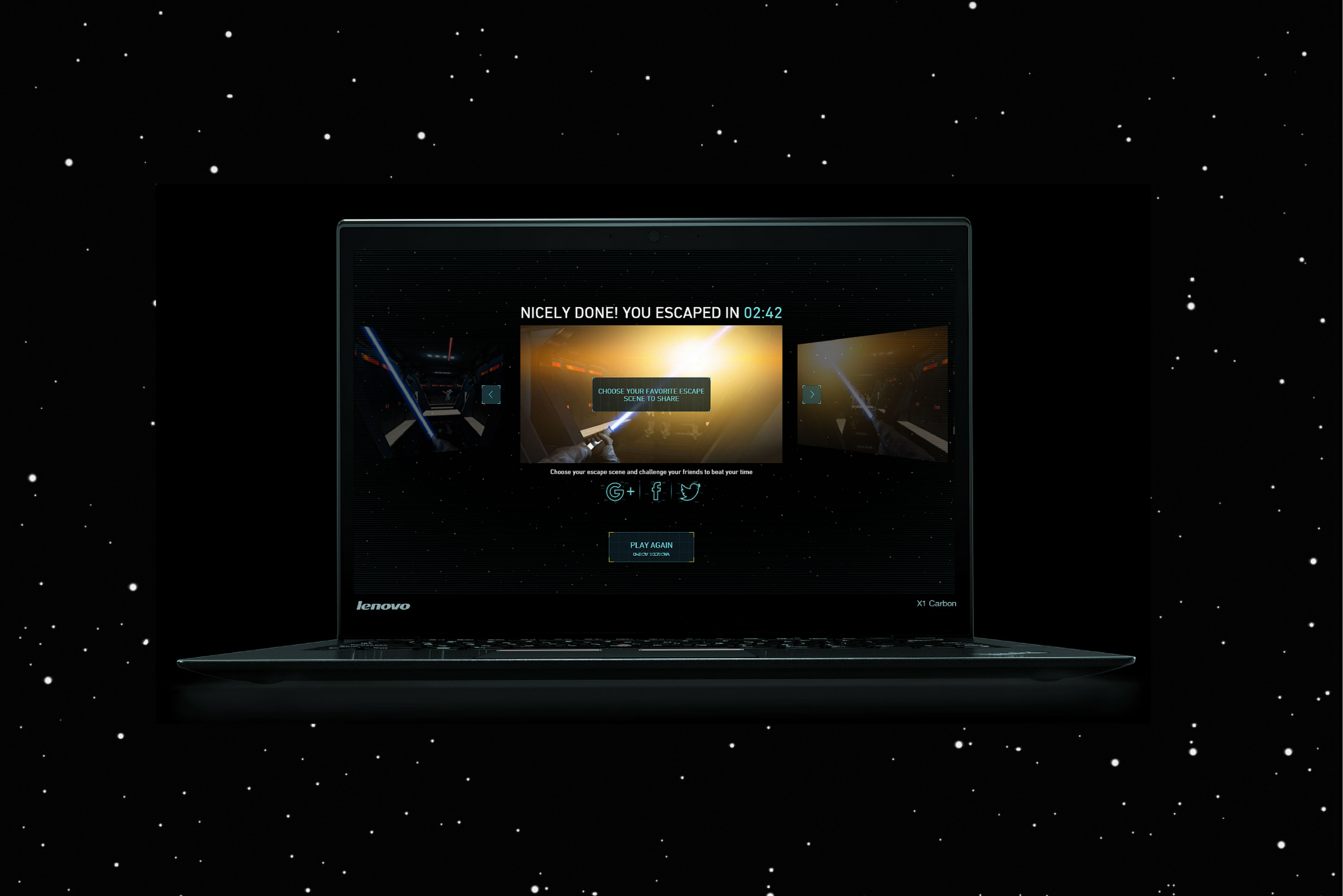
We encouraged users to share their escape time on social media to challenge their friends to escape in the shortest time possible. After users finish the experience, they can share an asset with their time on it.
We wanted to avoid any waiting time or runtime image generation before the shareable asset is ready for the user to post on social media. We pre-generated all possible combinations and uploaded all of them to Google Cloud Storage. When the user completed the experience, we were mapping the gameplay time to a unique image URL, with the appropriate time stamp already on it.
There were 12 visual pieces for the user to choose from. For each of them, we decided to limit the range of timestamps to 1-25 minutes and generate time stamps with a 1 second step. This meant pre-generating over 17,000 images. We wrote a Python script to do this and after couple hours, all 17k+ images were sitting on Google Cloud Storage, accessible in a blink of an eye.
Second Screen Interaction
The experiment is powered by HTML5 and WebGL. The desktop functions as the primary visual display, and the user’s mobile device operates as the primary control interface and secondary display.
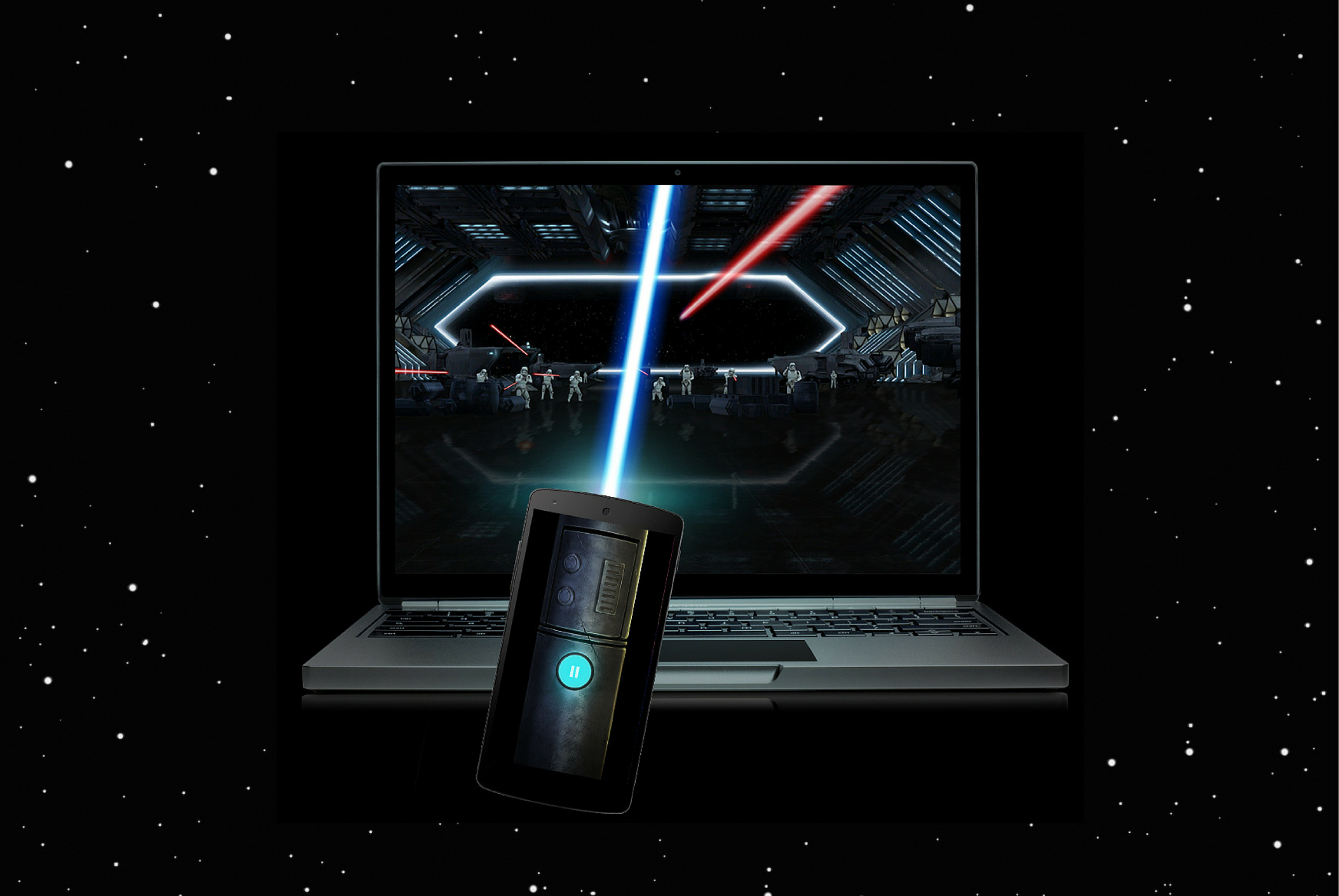
WebSockets allowed for second-screen interaction so that users could run the website on their desktop computer and smartphone simultaneously. Using the HTML5 device orientation and motion APIs, gyroscope and accelerometer data is transmitted to the website and used to move the lightsaber on the screen.
Ultimate 3D Experience in Browser
We wanted to create an experience with as much visual fidelity and as many complex interactions as a video game, but running in the browser instead of on a console. The second-screen interaction needed to be flawless and the 3D graphics had to run without any lag or frame-rate so that the lightsaber could move in real-time.
Creating a Lightsaber with Polymer
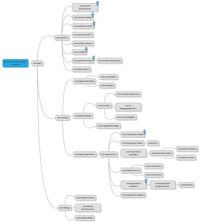
We used Polymer to create a high-performance WebGL mobile controlled Lightsaber that is modular and configurable. We review some of the key details of the project to help you save time when creating your own.
“It may be a Chrome Experiment, but this one works in other browsers, too. If Chrome and Safari can get along, maybe there’s hope for the First Order and the Resistance, after all.”
Credits
-
Division
-
Agency
-
Brand
-
Executive Producer
-
Interactive Project Manager
-
Interactive Project Manager
-
Creative Director
-
Art Director
-
Tech Lead
-
3D Supervisor
-
Front End Developer
-
Game Developer
-
WebGL Developer
-
WebGL Developer
-
Back End Developer
-
UX Designer
-
UX Designer
-
Storyboard Artist
-
Motion Graphics
-
Head of QA
-
QA Lead Tester
-
QA Senior Tester
-
QA Tester
-
3D Modelling and Animation
-
Sound Design
-
Technology
-
Platform
-
Industry
-
Target Market
-
Release Date
2015-12-16
